We hope you like the logo we chose for John’s Crazy Socks. We spent time and worked with lots of folks to come up with a design that reflected who we are and what we do. Here’s how it came about.
The Logo Matters
“Logos are the graphic extension of the internal realities of a company.” Saul Bass
We all know that logos are important. They are the visual representation of us; a logo is the picture of how we will be known. And the logo has to be real in the sense that that logo has to have integrity, has to reflect what Bass called “the internal realities of the company.” You can’t use a logo that creates an image different from what you are.
While we understood the critical importance of the logo, we also recognized that as a start-up, crafting a logo was just one of many key achievements we need to check off. We could not get stuck designing a logo when we needed to focus on our three S’s: Socks, Service and Special Olympics.
What We Wanted in Our Logo
We wanted our logo to set the tone for our business which meant that we needed to know what mattered to us. Here’s what we wanted our logo to display:
- Our name
- A sense that this is personal and there are real people behind this enterprise
- A sense of fun
- Energy
- Color
- A reinforcement that we are all about socks
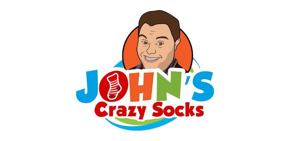
We made a decision early on that we wanted the logo to include picture of John. After all, the business is named for him and it would help drive home the idea that there were actual people behind this operation. The logo needed to show that the work we do for our customers was personal for us.
John selected a photo that he liked and we it turned into a cartoon. We had made it to step one.
Designing the Logo for John’s Crazy Socks
Companies can spend thousands or even hundreds of thousands of dollars on logo creation. We’re bootstrapping our start-up so we did not have those type of funds. And even if we did, you would want us to spend that money on finding great socks and providing great service, not a logo.
We had a design team, Digho Arts, with whom we had worked before and whose work we loved. Diane and Maria are worth every penny they earn and more. Their fees are reasonable and commensurate for the work they do, but they would take a big chunk out of our start-up budget. These are the type of decisions all start-ups have to make: we could not afford everything we wanted. We had to make decisions that reflected our priorities. We respectfully passed and turned to some online designer markets.
We opted to use Fiverr, a world-wide online marketplace for designers and other creative professionals. We picked a handful of graphic designers and worked with each to design a logo. This approach allowed for a diversity of approaches and gave us access to different insights.
The results? Some drafts were generic and bland, but a few stood out. We went back and forth with each, playing with colors and some design elements. When we had two favorites, we turned to social media to test them out. We posted both on Facebook to get feedback. Friends and family responded with insights and vehemence. Here’s the alternative logo:

Each logo had its fans. We have many artist and design friends, so their input was particularly helpful. We tinkered a little more before settling on our logo. It was designed by
Ahmed Ghumro.
Does the Logo for John’s Crazy Socks Work?
We’re happy with what we got and hope you like it. It features John’s smiling face, letting you know the spirit and commitment behind the brand. The green and blue swirls add an element of energy, the font of the letters are playful, the different colors add to the energy and enthusiasm. And we have a sock in the middle of the “O” reinforcing that we are all about the socks.
Will we keep this logo forever? Who knows. It fits now and we’re moving forward. Let us know what you think.


